UI/UX Design: How Great Design Can Double Your Conversion Rate
Bad design drives customers away. Great design converts. Discover key UI/UX principles to turn visitors into buyers—and how to apply them.

Introduction
You have a digital product: an app, an e-commerce site, or a SaaS platform. Visitors come to your site, explore your features, but very few convert. You invest in online ads to drive traffic, yet the results still fall short. Before spending more on marketing, it’s time to look inward: at your design.
Forrester Research shows that a well-designed interface can increase conversion rates by up to 200%, while poor design costs businesses over $1.2 billion annually in lost productivity. Design is not decoration — it’s a strategic tool that drives measurable business outcomes.
"Design is not just what it looks like and feels like. Design is how it works." — Steve Jobs
UI and UX: Two Complementary Concepts
Many people confuse UI and UX, but they are distinct and equally critical.
- UI (User Interface): Everything users see on your product — colors, typography, buttons, icons, spacing. UI ensures visual consistency and communicates your brand identity effectively.
- UX (User Experience): How the product works and feels. UX considers navigation flow, task completion, emotional response, and efficiency.
A product can have beautiful UI but frustrating UX. Users may admire the design but leave without completing a purchase. Conversely, a functional product with poor UI may feel untrustworthy at first glance. True excellence emerges when UI and UX work together seamlessly.
"A product’s design isn’t finished until every user interaction feels effortless." — our technical team
The 5 UX Principles That Boost Conversions
Improving UX is one of the most cost-effective ways to increase conversions. Here are five key principles:
1. Visual Hierarchy
Users process visual information in predictable patterns. Placing your call-to-action (CTA) where the eye naturally lands can significantly improve conversion rates. For example, a "Request a Quote" or "Buy Now" button should be prominent and above the fold whenever possible.
- Tip: Use contrast, whitespace, and positioning to guide attention. Avoid clutter around primary actions.
- Example: On e-commerce sites like Amazon, the “Add to Cart” button is highlighted in a consistent color and placed immediately near the product image.
2. The 3-Click Rule
Users should be able to find any key information within three clicks. Beyond that, attention drops sharply, and bounce rates increase. Navigation should be intuitive, consistent, and predictable.
- Tip: Group related features in clear categories. Use breadcrumbs or progress indicators in multi-step processes.
- Example: Booking platforms like Booking.com allow users to filter and sort results efficiently within three interactions.
3. Speed as UX
Performance is part of the experience. Research shows 53% of users abandon a site that takes longer than 3 seconds to load. Slow websites frustrate users, reduce trust, and hurt conversions.
- Tip: Optimize images, leverage caching, and minimize unnecessary scripts. Tools like Google PageSpeed Insights can help identify bottlenecks.
- Example: Shopify merchants who improve load time by 1 second often see a measurable increase in sales.
4. Mobile-First Design
With over 60% of web traffic coming from mobile devices, designing for mobile first is essential. Mobile-first doesn’t mean a scaled-down desktop site; it means prioritizing simplicity, speed, and touch-friendly interactions.
- Tip: Use larger tap targets, concise copy, and vertical layouts optimized for scrolling.
- Example: Instagram and TikTok focus on mobile-first UX, creating seamless and engaging vertical experiences.
5. Reducing Friction
Every additional choice or step introduces friction and increases the chance of abandonment. Simplify onboarding, forms, checkout flows, and any interaction that requires effort.
- Tip: Use autofill, minimize mandatory fields, and provide clear guidance. Highlight progress visually in multi-step flows.
- Example: Apple’s one-click checkout reduces friction and boosts conversion rates significantly compared to traditional forms.
"Every dollar invested in UX returns an average of $100." — IBM Research
The Design System: Invest Once, Gain Long-Term
A Design System is a centralized library of reusable components — buttons, forms, cards, modals — with established rules for typography, colors, and spacing. It ensures consistency, speeds up development, and simplifies the addition of new features.
- Benefits:
- Faster development cycles.
- Consistent visual language across platforms.
- Easier onboarding for new team members.
Tools like Figma or Adobe XD enable teams to maintain a living Design System that evolves alongside your product.
"A design system is not just a toolkit; it’s the foundation of scalable product excellence." — our technical team
UX Metrics and Testing
Investing in design is only effective if decisions are validated by real users. Key metrics include:
- Conversion rate: Percentage of users completing desired actions.
- Task success rate: Percentage of users who successfully perform a key action.
- Time on task: How long it takes to complete an action.
- Error rate: Frequency of mistakes or failed actions.
Regular user testing, A/B testing, and session recordings help identify friction points before they impact conversions at scale.
Conclusion
Design is not a cost — it’s a growth lever. If your digital product isn’t performing as expected, start with your UX. By auditing interfaces, identifying friction, and implementing a cohesive Design System, your product can delight users, increase trust, and maximize conversions.
"Investing in UX is investing in your business’s future." — our technical team
A well-designed product doesn’t just look good; it works efficiently, communicates clearly, and converts consistently. Start with UX, combine it with thoughtful UI, and you create a digital experience that users love and actually engage with.
Continue Reading
Read Also
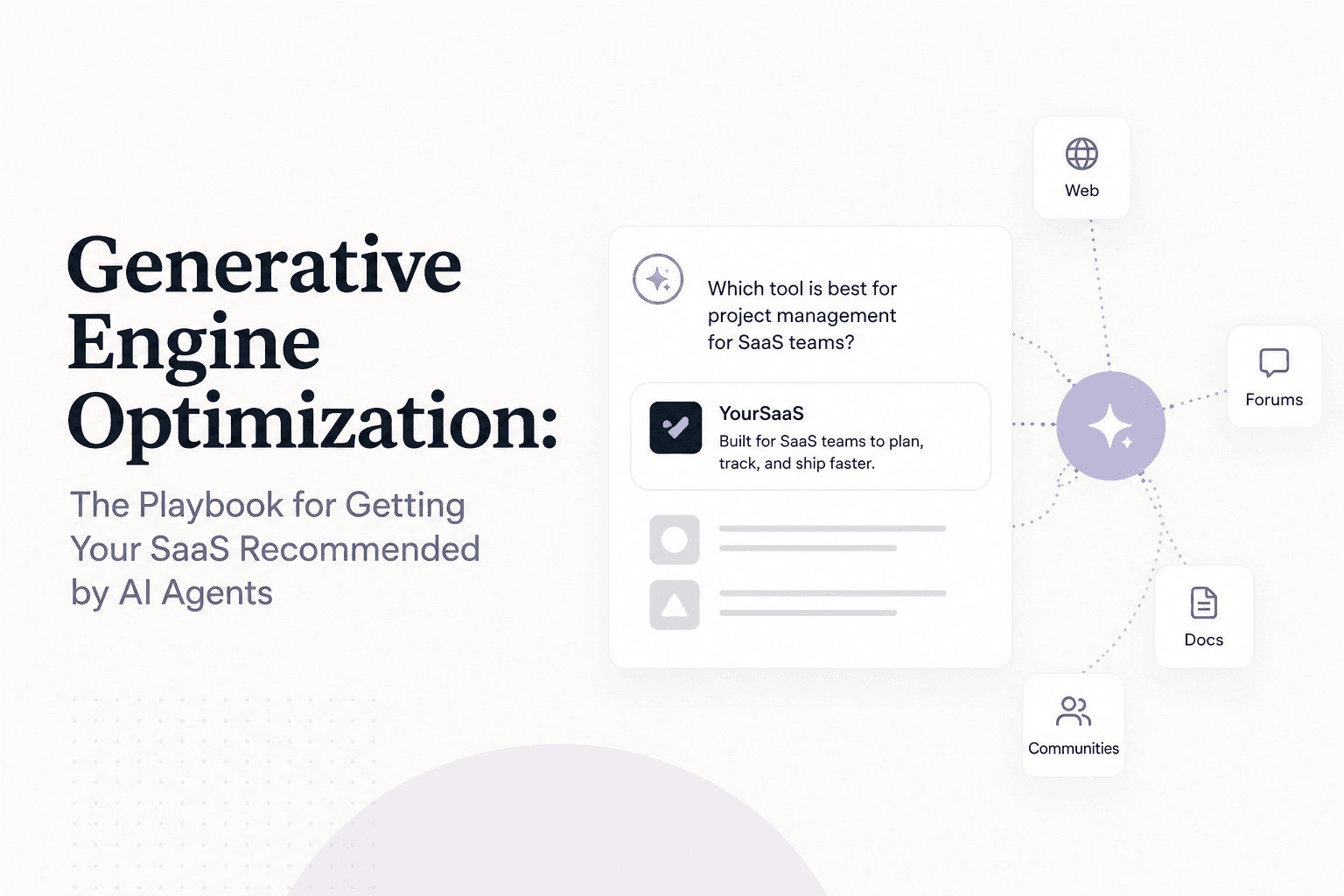
Generative Engine Optimization: The Playbook for Getting Your SaaS Recommended by AI Agents
Generative Engine Optimization (GEO) is the practice of optimizing your SaaS so AI systems like ChatGPT and Claude recommend your product to users.
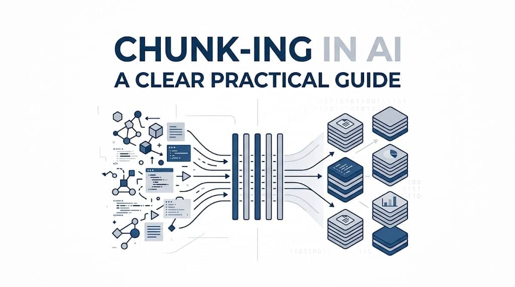
Chunking in AI: A Clear Practical Guide
Chunking is an AI preprocessing method that splits large texts or datasets into smaller, manageable parts for easier NLP and LLM processing.
Why Your Business Absolutely Needs a Professional Website in 2026
A website isn’t a luxury—it’s your 24/7 global storefront. Invest in a professional site and make your business more profitable in 2025.